

Introduction
Have you ever looked at a dashboard and thought: “Wow, sales are skyrocketing!”, only to realize later it was just a short-term spike?
This happens all the time. Dashboards show us numbers, but without the right context, they can mislead us.
In today’s post, I want to talk about a concept that’s pretty useful but often overlooked in reporting: the moving average. We’ll explore why a simple average isn’t always enough, what a moving average really tells us, and how to implement it in Power BI to uncover the true story behind your data.
Why is it overlooked? Because of its more famous (and frankly less insightful) cousin, the average (also called mean), who tends to steal the spotlight. So let’s start with the meaner cousin.
What is an average?
An average (or mean) is simply the sum of all values divided by the number of values.
For example, if your monthly sales over three months are $10K, $12K, and $14K, the average is:
(10,000 + 12,000 + 14,000)/ 3 =1 2,000
Pretty straightforward.
Now let’s expand this to a longer period:
| Month | Sales ($) |
| January | 10.000 |
| February | 12.000 |
| March | 14.000 |
| April | 11.000 |
| May | 12.000 |
| June | 12.000 |
| July | 8.000 |
| August | 8.500 |
| September | 6.000 |
| October | 6.500 |
Total = $100.000 → Average = $10.000
So the average is $10.000. Could we use it to assume that the November sales are going to be around $10.000? The overwhelming feeling you get by looking at this data is that 10K is a very optimistic prediction for the month of November.
Clearly, something shifted in the second half of the year. But the average hides that story.
So, while the average is mathematically correct, it doesn’t really reflect what’s going on, does it?
Now let’s look at the brighter one from the family.
Enter the moving average
A moving average smooths out short-term fluctuations by calculating the average over a sliding window of time.
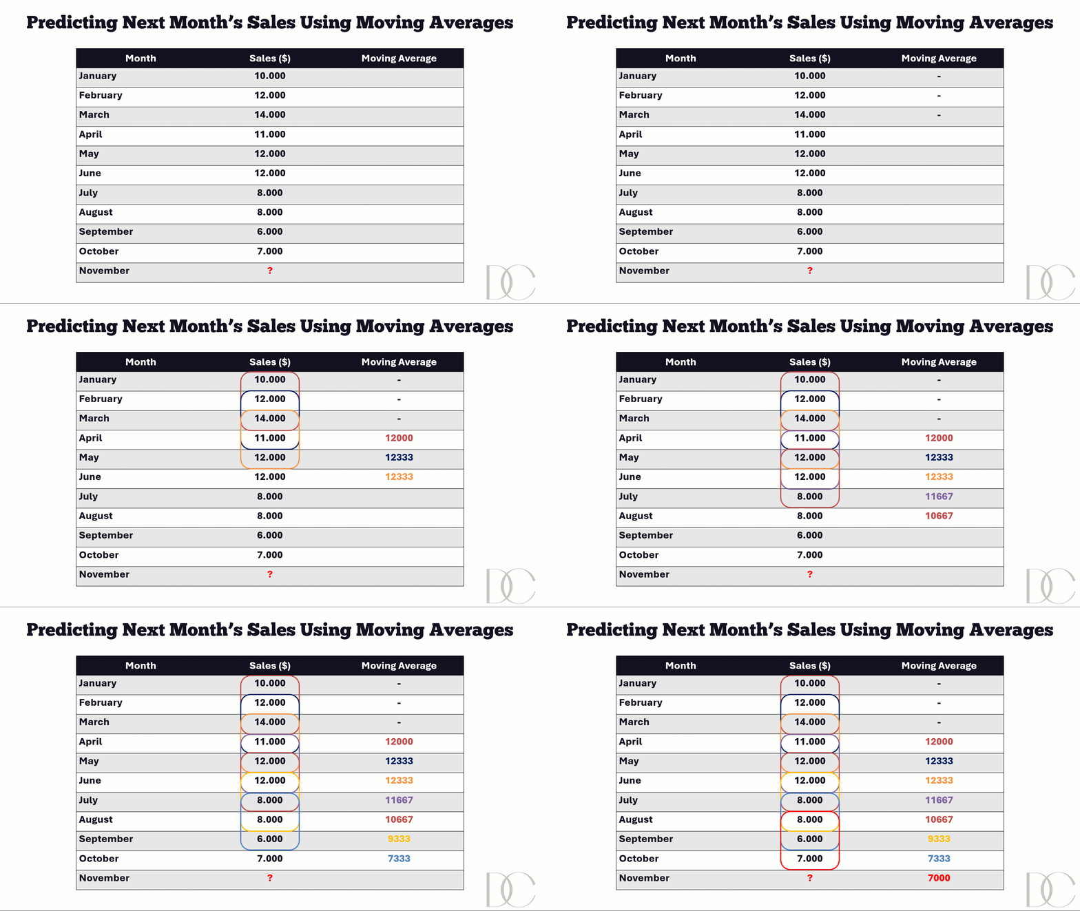
Instead of grouping all 10 months together, you focus on a smaller window — for example, the last 3 months at any given point. When new data comes in, the window moves forward, and the oldest period drops off.
I created an example in the following gif to see how the moving averages are calculated for these months and how they can be used to predict a future value.
Why moving averages matter in BI
- They help uncover the underlying trend in volatile data
They reduce the “noise” of random spikes or drops
They make reports easier for stakeholders to interpret
In other words: moving averages don’t just summarize — they help reveal the story hidden in the numbers.
The Limitations of Moving Averages
As helpful as moving averages are, they’re not a silver bullet. A few things to keep in mind:
- They lag behind reality. A moving average is always based on past data, so it may take time before it reflects sudden changes.
- Window size matters. Too short, and your average is still noisy. Too long, and you risk smoothing over meaningful changes.
- They can hide seasonality. If your business has strong seasonal cycles (like retail or travel), a moving average might flatten them out in ways that make the data less useful.
Real-World BI Use Cases
Despite these limitations, moving averages shine in many everyday BI scenarios. For example:
- Sales trends: Instead of panicking when sales dip one month, a moving average helps you see if it’s just a blip — or if there’s a real downward trend.
- Product launches: New products often sell like crazy at first, then slow down. A moving average shows whether sales are stabilizing or dropping off after the initial excitement.
- Website traffic: One viral post or ad campaign can make traffic spike. The moving average smooths it out so you can see whether your site is actually growing over time.
- Conversion rates: Daily conversions jump around a lot. Looking at a moving average tells you if your marketing experiments are really making a difference.
- Inventory demand: One big bulk order can trick you into thinking demand is up. A moving average helps you see the underlying buying pattern.
- Customer satisfaction (CSAT): A handful of angry reviews can make your dashboard look terrible. The moving average gives a more balanced picture of how customers feel overall.
Using Moving Averages in Customer Support
Moving averages are especially powerful in customer support analytics, where day-to-day ups and downs can be confusing:
- Ticket volumes: A sudden surge in one week might just be a temporary issue. A 4-week moving average reveals whether demand is consistently rising.
- Response times: Instead of reacting to a bad day, the moving average shows whether your team is actually improving service efficiency.
- Satisfaction scores: Outlier feedback (like one very unhappy customer) won’t distort the trend. A moving average provides a clearer picture of overall customer sentiment.
By smoothing customer support metrics, you give managers and teams a more reliable view of performance, helping them focus on sustainable improvements rather than short-term noise.
Example in Power BI
Option1: Creating a Measure Using DAX
Now let’s look at an example in Power BI, using the Sales data from above.
I’ve created two tables:
- Date (a date table)
- Monthly Sales (a table containing the monthly sales and the month in which they happened).
These are linked by the Date column.
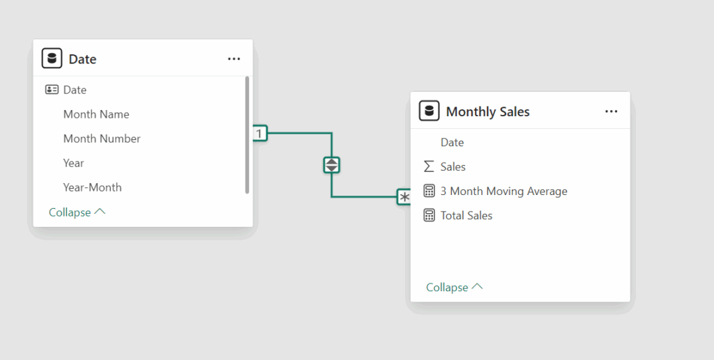
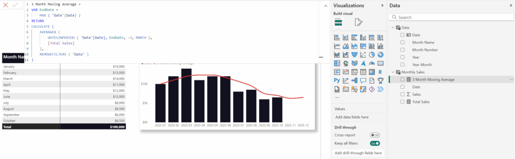
I can use the following DAX code to create the 3 month moving average:
Total Sales =
SUM('Monthly Sales'[Sales])

3 Month Moving Average =
VAR EndDate =
    MAX ( 'Date'[Date] )
RETURN
CALCULATE (
    AVERAGEX (
        DATESINPERIOD ( 'Date'[Date], EndDate, -3, MONTH ),
        [Total Sales]
    ),
    REMOVEFILTERS ( 'Date' )
)
Let me know in the comments if you’d like me to explain in more detail what this code does.
Option 2: Creating a Visual Calculation
Another way to build a moving average in Power BI is by using a visual calculation.
First, I select the field I want to base it on, in this case: Sales. The next step is to choose the window size. I went with 3, meaning a 3-month moving average. There are additional parameters you can set, but for most scenarios these two are enough to get the job done.

And just like that, voilà! The moving average appears, giving the same result as the DAX-based calculation.
So what’s the difference between the two?
- The visual calculation exists only inside the specific visualization where you created it.
- The DAX measure can be reused anywhere in your report
Conclusion and Key Takeaways
- A simple average can hide important shifts and patterns in your data.
- A moving average smooths out random fluctuations, making long-term trends clearer.
- In Power BI, you can create moving averages with DAX or visual calculations—each has its pros and cons.
- Moving averages are useful across many BI scenarios: sales, web traffic, inventory, or customer support metrics.
Next time you see a sudden jump or drop in your dashboard, don’t just rely on the average. Add a moving average and see the bigger picture.
I’d love to hear from you! Have you ever seen an “average” that told the wrong story, or used moving averages to reveal the real trend? Share your experiences in the comments, your examples might spark new ideas for others too.
Leave a Comment